Nervex © Optimized Dashboard for Website Performance Analytics
Nervex © Optimized Dashboard for Website Performance Analytics
Nervex © Optimized Dashboard for Website Performance Analytics
Time
Data Intelligence & Business Insights
Project
SaaS Dashboard Driving Better Insights
Driving Results: Optimized Dashboard for Website Performance Insights
Driving Results: Optimized Dashboard for Website Performance Insights
Driving Results: Optimized Dashboard for Website Performance Insights
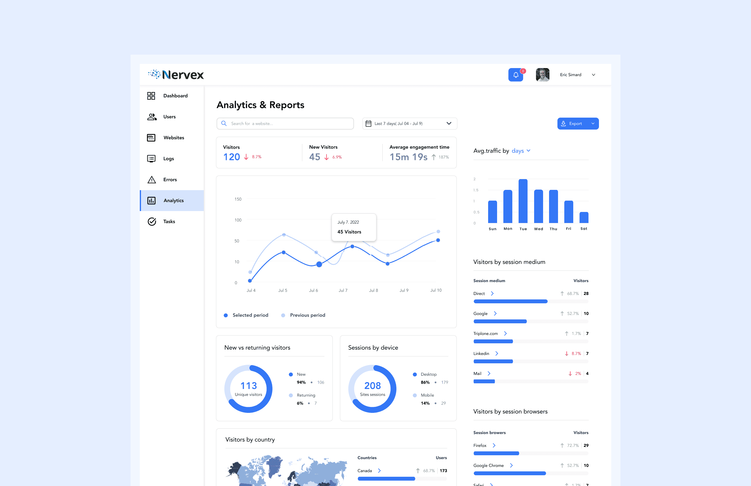
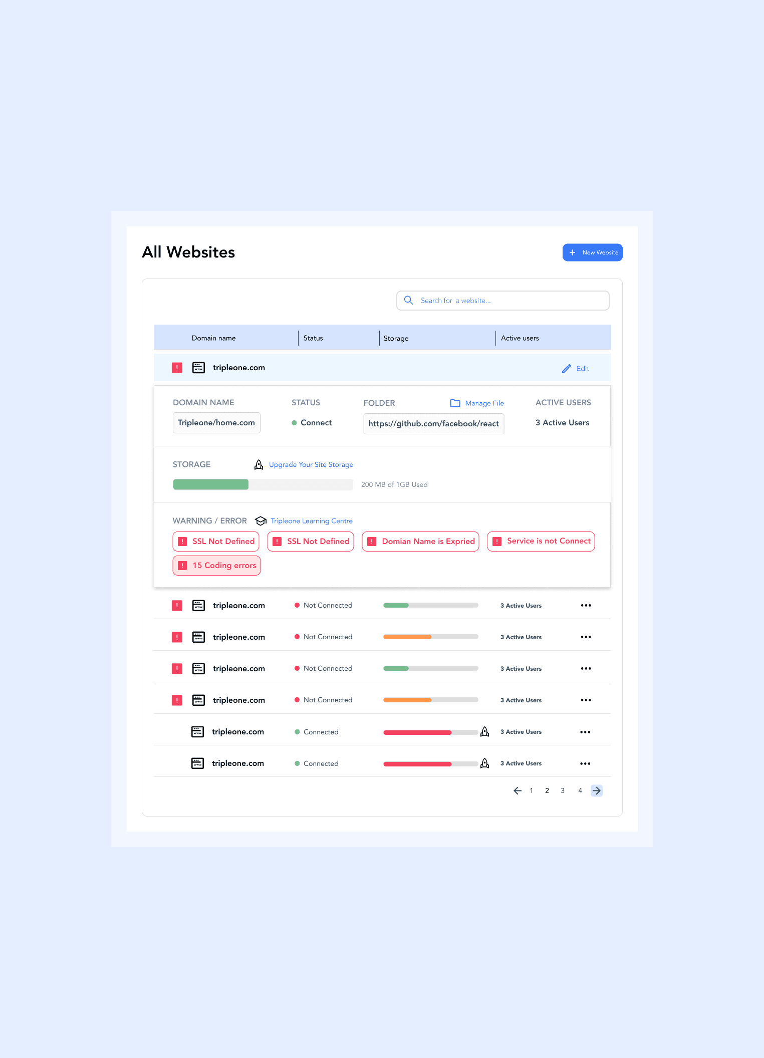
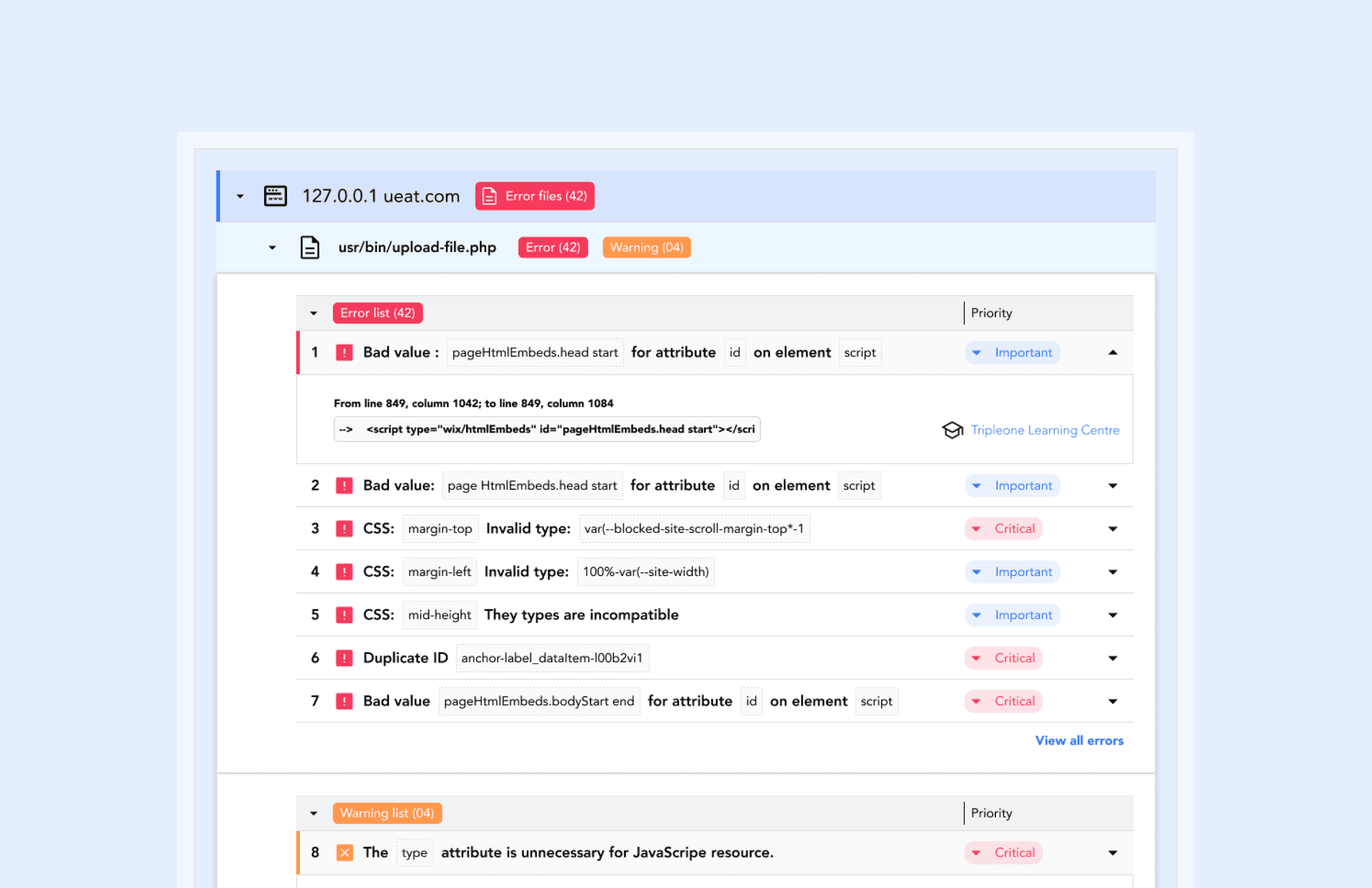
The Nervex dashboard redesign revolutionized website performance analysis by introducing streamlined visualizations, actionable insights, and personalized user experiences. This overhaul aimed to empower users to make data-driven decisions with ease and precision. Key Challenges: ➡️ Unclear Data Presentation: Metrics were difficult to interpret due to a lack of organized, visually compelling data visualization. ➡️ Overwhelming Interface: The cluttered dashboard made it hard for users to focus on relevant information and insights. ➡️ Limited Personalization: Users lacked the ability to customize their dashboard to highlight metrics that mattered most to them.
The Nervex dashboard redesign revolutionized website performance analysis by introducing streamlined visualizations, actionable insights, and personalized user experiences. This overhaul aimed to empower users to make data-driven decisions with ease and precision. Key Challenges: ➡️ Unclear Data Presentation: Metrics were difficult to interpret due to a lack of organized, visually compelling data visualization. ➡️ Overwhelming Interface: The cluttered dashboard made it hard for users to focus on relevant information and insights. ➡️ Limited Personalization: Users lacked the ability to customize their dashboard to highlight metrics that mattered most to them.
The Nervex dashboard redesign revolutionized website performance analysis by introducing streamlined visualizations, actionable insights, and personalized user experiences. This overhaul aimed to empower users to make data-driven decisions with ease and precision. Key Challenges: ➡️ Unclear Data Presentation: Metrics were difficult to interpret due to a lack of organized, visually compelling data visualization. ➡️ Overwhelming Interface: The cluttered dashboard made it hard for users to focus on relevant information and insights. ➡️ Limited Personalization: Users lacked the ability to customize their dashboard to highlight metrics that mattered most to them.
Figma Link
Figma Link
Figma Link